Octave clustering demo part 6: (more) evaluation
[This post is part of the Octave clustering demo series]
This new clustering demo goes deeper into evaluation, showing some techniques to get an idea about the clustering tendency of a dataset, find visual clues about the clusters, and get a hint about the "best" number of clusters. If you have attended the PAMI class this year you probably know what I am talking about. If instead you are new to these demos please (1) check the page linked above and (2) set up your Octave environment (feel free to download the old package and play with the old demos too ;-)). Then download this new package.
If you want to check out the older Octave clustering articles, here they are: part 0 - part 1 - part 2 - part 3 - part 4 - part 5. I strongly suggest you to run at least parts 0-3 before this demo, as they provide you all the basics you need to get the best out of this exercise.
Note that some of the functions available in previous packages are also present in this one. While it is ok to run the previous examples with those functions, make sure you are using the most up-to-date ones for the current experiments, as I debugged and optimized them for this specific demo.
Run the evaluationDemo1 script. This will generate a random dataset and walk you through a sequence of tests to evaluate the clustering tendency and ultimately perform clustering on it. As random clusters might be more or less nasty to cluster, I suggest you to try running the demo few times and see how it behaves in general. Note that part of the code is missing and you will have to provide it for the demo to be complete.
When you feel confident enough with evaluating the random dataset, run the evaluationDemo2 script. This will be a little more interactive, asking you to choose, between three datasets, the one which has the most "interesting" content, and requiring you to write small pieces of code to complete your evaluation.
At the end of your experiment, answer the following questions:
- comment the different executions of evaluationDemo1. How sensitive to "bad" overlapping clusters are SSE elbow and distance matrix plot? Does the presence of overlapping clusters affect the clustering tendency test? How do you think it would be possible (and in this case, would it be meaningful) to distinguish between two completely overlapping clusters?
- comment the different executions of evaluationDemo2. Which is the "interesting" dataset? Why? Is the SSE elbow method useful to automatically detect the number of clusters? Why? What additional information does the distance matrix convey? Is Spectral clustering better than k-Means? Did you happen to find parameters that give better accuracy than the default ones?
If you are a PAMI student, please write your answers in a pdf file, motivating them and providing all the material (images, code, numerical results) needed to support them.
Hints:
- the demo stops at each step waiting for you to press a key. You can disable this feature by setting the "interactive" variable to zero at the beginning of the script;
- the second demo file has some "return" commands purposely left in the code to stop the execution at given points (typically when you need to add some code before proceeding, or to increase the suspance ;-));
- I tested the code on Octave (3.6.4) and MATLAB (2011a) and it runs on both. If you still have problems please let me know ASAP and we will sort them out.
Octave clustering demo part 5: hierarchical clustering
[This post is part of the Octave clustering demo series]
So, if you read this you probably have already unpacked the tgz file containing the demo and read the previous article about k-medoids clustering. If you want to check out the older Octave clustering articles, here they are: part 0 - part 1 - part 2 - part 3.
Run the hierarchicalDemo script (if launched without input parameters, it will open the "crescents.mat" data file by default). The script will plot the dataset, then it will try to perform clustering using first k-means and then an agglomerative hierarchical clustering algorithm. Run the algorithm with all the datasets available (note that you will need to modify the code to make it work with different numbers of clusters).
Questions:
- how does k-means perform on the non-globular datasets (crescents, circles01, and circles02)? What is the reason of this performance? how does hierarchical algorithm perform instead?
- now let us play with the "agglomerative" dataset. Information is missing so you know neither the number of clusters in advance nor the ground truth about points (i.e. which class they belong to). First of all, run the hclust function with different numbers of clusters and plot the results. Are you satisfied with them? What do you think is the reason of this "chaining" phenomenon?
- complete the code in hclust.m so it also calculates complete and average linkage, and run the algorithm again. How do clustering results change? Plot and comment them.
Octave clustering demo part 4: k-Medoids
[This post is part of the Octave clustering demo series]
Here follows the description of the first of two new Octave clustering demos. If you have attended the PAMI class this year you probably know what I am talking about. If instead you are new to these demos please (1) check the page linked above and (2) set up your Octave environment (feel free to download the old package and play with the old demos too ;-)). Then download this new package.
Run the kMedoidsDemo script (if launched without input parameters, it will open the "noisyBlobs01.mat" data file by default). The script will plot the dataset, then it will try to perform clustering using first k-means and then k-medoids. Run the experiment many times (at least 4-5 times) for each of the three noisyBlobs datasets (you can pass the dataset path and name as a parameter to the kMedoidsDemo function).
Questions:
- comment the "worst case" results you get from k-means: what happens and how does noise influence this behavior?
- compare the results you get with k-means with the ones you get with k-medoids: how does k-medoids deal with the presence of noise?
- what would happen if noise points were much farther from the original clusters? Try to get few (1-2) of them and bring them very far from the rest of the data… what are the results you get from k-means and k-medoids?
Hints:
- the demo stops at each step waiting for you to press a key. You can disable this feature by setting the "interactive" variable to zero at the beginning of the script;
- there are two different k-means implementations you can run: feel free to try both just by uncommenting their respective code.
New TR: Multimodal diffusion geometry by joint diagonalization of Laplacians
Hi all,
this paper is something I am particularly happy to share, as it is the first report related to my new research theme (wow, this reminds me that I should update my research page!). The coolest aspect of this topic is that, despite looking different from my previous work, it actually has a lot of points in common with it.
As some of you may know, many previous works of mine heavily relied on different implementations of the concept of similarity (e.g. similarity between tags, between tourism destinations, and so on). This concept has many interpretations, depending on how it is translated into an actual distance for automatic calculation (this is what typically happens in practice, no matter how "semantic" your interpretation is supposed to be).
One of the main problems is: in a rich and social ecosystem like the Web is, it is frequent to find different ways to define/measure similarity between entities. For instance, two images could be considered similar according to some visual descriptors (e.g. SIFT, or color histograms), to tags associated with them (e.g. "lake", "holiday", "bw"), to some descriptive text (e.g. a Wikipedia page describing what is depicted), metadata (e.g. author, camera lens, etc.), and so on. Moreover, people might not agree on what is similar to what, as everyone has their own subjective way of categorizing stuff. The result is that often there is no single way to relate similar entities. This is sometimes a limit (how can we say that our method is the correct one?) but also an advantage: for instance, when entities need to be disambiguated it is useful to have different ways of describing/classifying them. This is, I believe, an important step towards (more or less) automatically understanding the semantics of data.
The concept I like most behind this work is that there are indeed ways to exploit these different measures of similarity and (pardon me if I banalize it too much) find some kind of average measure that takes all of them into account. This allows, for instance, to tell apart different acceptations of the same word as it can be applied in dissimilar contexts, or photos that share the same graphical features but are assigned different tags. Some (synthetic and real-data) examples are provided, and finally some friends of mine will understand why I have spent weeks talking about swimming tigers ;-). The paper abstract follows:
"We construct an extension of diffusion geometry to multiple modalities through joint approximate diagonalization of Laplacian matrices. This naturally extends classical data analysis tools based on spectral geometry, such as diffusion maps and spectral clustering. We provide several synthetic and real examples of manifold learning, retrieval, and clustering demonstrating that the joint diffusion geometry frequently better captures the inherent structure of multi-modal data. We also show that many previous attempts to construct multimodal spectral clustering can be seen as particular cases of joint approximate diagonalization of the Laplacians."
… and the full text is available on ArXiv. Enjoy, and remember that --especially in this case, as this is mostly new stuff for me-- comments are more than welcome :-)
Octave clustering demo part 3: spectral clustering
[This post is part of the Octave clustering demo series]
This is (currently) the last of my posts devoted to clustering demos. If you haven't downloaded the file containing Octave code yet, you can get it here. If you want to read the previous articles, here they are: part 0 - part 1 - part 2.
The last demo in the package shows you how spectral clustering works. Spectral Clustering is a relatively recent approach to clustering that I found very interesting, especially because it addresses some of the limitations of k-means but, at the same time, it relies on k-means itself! What it does in practice is finding a new space where localities are preserved, emphasizing both the cohesion and the separation of clusters, thus allowing k-means to work at its best. If you are curious and want to delve deeper into this topic, you will find more material in the following page: Paper Review: A Tutorial on Spectral Clustering.
I was quite surprised not to find ready code for spectral clustering in Octave, but probably I just had not searched (well) enough. By the way, if you came here searching for it here is an(other?) implementation, together with some examples and data to play with: feel free to try it and to leave your feedback!
The spectralDemo function can be called as follows:
spectralDemo(dataset,nn,t)
where dataset is the usual dataset path+name, while nn and t are parameters used to build the (weighted) adjacency matrix describing similarity relationships between data points. Respectively, nn specifies the number of nearest neighbors for a point (a point is connected to another if it appears as one of its top nn nearest neighbors) and t is the parameter for the Gaussian similarity function s(xi,xj)=exp(-(xi-xj)^2 / t). My suggestion is to play with both parameters, but once you understood how they work you can just keep t=0 for the automatic tuning of the kernel and focus only on nn. Good values of nn range between 10 and 40, but of course you are free to test others (but keep in mind that the bigger the value, the slower the whole algorithm is! Can you say why?). The script performs the following tasks:
- it calculates the weighted adjacency matrix and plots both the distances between points and the weights between nodes in the adjacency graph (this allows one to inspect whether parameters need to be trimmed to have a more/less connected graph, and also to understand when the graph approach might work better than a classical euclidean distance approach);
- it builds the graph Laplacian and calculates its eigenvalues and eigenvectors. Then, it plots eigenvalues for inspection (this allows one to understand --if the dataset is clean enough-- how many connected components/natural clusters are present in the graph);
- to compare results between k-means and spectral clustering, it runs k-means both in the euclidean space and in the eigenspace built out of the top k eigenvectors, then shows both clusterings with related SSEs and accuracies.
And now, here are the usual maieutical questions:
- what are the datasets in which spectral clustering performs definitely better than k-means?
- how much do the results of spectral clustering depend on the input parameters?
- how would you evaluate the quality of a labeling done with spectral clustering? How would you apply that to find which is the best number of nearest neighbors to take into account?
- how often (according to your tests with different datasets) does the rule "the number of 0-valued eigenvalues matches the number of clusters" holds? How ofted does its "relaxed version" hold? (if the question is not clear check spectral clustering notes/papers)
- how worth would be to use algorithms other than k-means to do clustering in the eigenspace?
That's all... have fun with the demos and with spectral clustering :-)
Octave clustering demo part 2: cluster evaluation
[This post is part of the Octave clustering demo series]
So, if you read this you probably have already unpacked the tgz file containing the demo, read the previous article, and ran demos 1 and 2. This post describes in detail the third demo, devoted to cluster evaluation.
In the previous article you saw how you can use an internal evaluation index to get better results from k-means. The main difference between internal and external indices is that the former (e.g. SSE) do not require additional information (such as the original labeling of data points), while the latter (e.g. accuracy) typically rely on that. SSE was used to evaluate the quality of different k-means executions, then the result providing the lowest SSE was considered the best one.
All of this was done supposing we already knew the correct number of clusters in the dataset (the variable clusters we used was actually provided, together with the data points and their classes). In the real world, however, this is not always true: you will typically lack not only the original classification (which is obvious, otherwise you would not need to run a clustering algorithm!), but also the best number of groups you want to divide your data into. So, you will have to find it... But what does best mean, in this case?
In kMeansDemo3 we employ the same SSE function to compare different executions of k-means. These are the main steps performed by the script:
- for k varying between 2 and 10
- run k-means 10 times (to address the random initialization problem, by choosing the lowest-SSE clustering)
- save the best (lowest) SSE and the matching clustering result
- plot the best SSE values for k=2, 3, ..., 10
- allow the user to decide which k is best, then plot that result and show both its SSE and its accuracy.
… Yes, there is nothing automatic in this :-). The reason is that I wanted you to get a grasp of how SSE changes with k and how to interpret it. This is strongly connected to what I wrote early about what best means in this case.
If you look at the SSE plot, you will see that it always decreases with increasing values of k. Which is reasonable, if you think that by increasing the number of clusters you will have points which are closer and closer to their centroids, up to the case when every point is the centroid of its own 1-point cluster and SSE becomes zero. This is totally different from the case in which the number of clusters was given and we just had to take the lowest-SSE results. How can we choose, then, the best k?
By looking again at the SSE plot, you will notice that the value of SSE always decreases, but for some values of k the change is bigger than for others. To find the best k, what we should look for is where the decrease changes most, that is the "elbow" inside the plot where the difference in change is maximum. Of course, this is quite easy to spot visually but not always trivial in terms of calculations. Some code that roughly does the trick follows:
    diffs = [sse(2:end) 0]-sse;    % calculates differences in SSE between each (k,k-1) pair
    ratios = [diffs(2:end) 0]./diffs;    % calculate ratios between differences
    k = find(ratios == min(ratios(ratios>0))) + 1;    % get lowest ratio (constrained to be >0 to ignore case k=1 and k=max)
... however, there are still cases (even in the provided datasets) where it does not perform well, especially when k-means is not the best algorithm for a given dataset. Run this demo both with blobs and circles/crescents datasets and try to answer the following questions:
- were you always able to calculate the correct number of clusters using the code provided above?
- were you always able to visually detect the correct number of clusters by looking at the SSE plot?
- was the value of k you estimated confirmed by the final plot/the accuracy calculated against the ground truth?
- how would you fix the code provided above to automatically estimate k even in the "blobs03" example? (note: if the code already gives you the correct k do not worry, just skip this question (see comments below ;)).
- how would you fix the code provided above to automatically estimate k in the circles/crescents examples?
This time I really wrote a lot of questions :) Don't worry, some of them will be (partially) answered in the next tutorial!
Octave clustering demo part 1: k-means
[This post is part of the Octave clustering demo series]
So, if you are here you probably have already unpacked the tgz file containing the demo and done your first experiments trying to run Octave scripts. Great! This post describes in detail the first two demo files: kMeansDemo1 and kMeansDemo2.
Try to run kMeansDemo1. You should execute it as kMeansDemo1(dataset), where dataset is one of the .mat files saved in the data directory. For instance, supposing your current working directory is the one where you unpacked the .tgz file, you could run:
kMeansDemo1('./data/blobs01.mat')
Now, all the demos are somehow interactive, that is they will plot stuff, comment the results in the main window and ask you to press a key to continue. All the demos have the possibility of becoming non-interactive: this is done by setting the variable "interactive" in the scripts to 0. Here are the main operations that the first demo performs:
- it plots data, so that "real" clusters (i.e. the ground truth, not the detected ones) are shown. Note that for all the datasets provided you have points (variable X), ground truth (variable classes), and number of clusters (variable clusters);
- for three times, it runs the k-means algorithm trying to identify clusters in data. This is the original page where k-means code comes from, and here is an example of how it can be called (thanks Dan for sharing!);
- every time the algorithm ends, its accuracy is calculated and shown together with the clustering results. Note that bad behaviors are foreseen and in some cases you just cannot reach 100% accuracy with a simple k-means.
After you run the full example, try to answer the following questions:
- Were the results the same? If not, can you tell why? Feel free to open myKmeans.m to better understand how it works.
- During the class we said that you can initialize k-means by just choosing random positions for centroids or by using some smarter heuristics (e.g. using actual data points for initial centroids, choosing them as far as possible from each other, and so on). Does myKmeans.m use these kind of heuristics?
- How would you modify the algorithm to obtain better/more stable results?
The second demo, kMeansDemo2, partially answers the last question, providing a way to address the random centroid initialization problem. Still, this remains non-deterministic, however there are many more chances to have better results by following its approach. The main idea is: find a way to evaluate how well k-means performed, then run it many times and keep only the best results.
A pretty common way to evaluate clustering algorithm performances is to use SSE (Sum of Squared Errors), that is the sum of all the (squared) distances between points in the dataset and the centroids of the clusters they have been assigned to. What we want are clusters which are, at the same time, tight (i.e. where points are near to their centroids) and far apart from each other. SSE mainly deals with the first of these two characteristic, returning results which should be as low as possible for a clustering to be good. So, the demo does the following:
- it runs k-means 10 times
- each time, it calculates the SSE for the whole clustering
- it keeps the lowest SSE (and matching cluster labels) as the best result, then shows it to the user
After running the demo with different datasets, try to answer the following questions:
- Does the quality of the algorithm only depend on the number of repetitions, i.e. is it always possible to get 100% accuracy by running k-means a sufficiently high number of times?
- Is the initialization of the bestSSE variable correct in kMeansDemo2 code? Does the code work fine for all the examples?
- Why didn't we directly use the accuracy function to evaluate the algorithm performances, checking the correctness of the assigned labels with respect to ground truth?
- Now that we get stabler results, compare the plots of two clusterings obtained in different executions. Are labels (i.e. colors in the plot) equal from one execution to the other? If not, does that matter? How are they evaluated against ground truth?
Octave clustering demo part 0: introduction and setup
As promised to my PAMI students, I have prepared a couple of demos to get a better grasp of how different clustering algorithms work. Hoping they could be useful for somebody else (and sure that this way I will not lose them so easily ;-)) I have decided to post more information about them here.
All the demos are in one single file and can be downloaded from the course page together with slides and other material (or if you only want the demo file follow this direct link). Once unpacked, you will find the following:
- data/*.mat (some example datasets)
- accuracy.m (calculates clustering accuracy)
- adjacency_weighted.m (calculates the weighted adjacency matrix used by spectral clustering)
- kMeansDemo*.m (k-means demos)
- L2_distance.m (calculates L2 distance between two vectors/matrices)
- laplacian.m (builds the Laplacian used by spectral clustering)
- myKmeans.m (performs k-means clustering)
- plotClustering.m (given clustered data and ground truth, plots clustering results)
- repKmeans.m (automatically repeats k-means ntimes and keeps the result with lowest SSE)
- spectralDemo.m (spectral clustering demo)
- SSE.m (given clustered data and centroids, calculates total SSE)
- uAveragedAccuracy.m (another way to calculate clustering accuracy)
To run the code just open Octave, cd into the spectralClustering directory, and call the different functions. The demo files are executed in the following ways:
    kMeansDemo1(dataset);
    - or -
    spectralDemo(dataset,nn,t);
where dataset is one of the files in the data directory, nn is the number of nearest neighbors for the calculation of the adjacency matrix, and t is the parameter for the Gaussian kernel used to calculate similarities in the weighted adjacency matrix (0 can be used for auto-tuning and usually works fine enough). For example:
    kMeansDemo1('./data/blobs03.mat');
    - or -
    spectralDemo('./data/circles02.mat',10,0);
Good values of nn for these examples range between 10 and 40... I will let you experiment which ones are better for each dataset ;-). Now feel free to play with the demos or read the following tutorials:
- Octave clustering demo part 1: k-means
- Octave clustering demo part 2: cluster evaluation
- Octave clustering demo part 3: spectral clustering
- Octave clustering demo part 4: k-medoids
- Octave clustering demo part 5: hierarchical clustering
- Octave clustering demo part 6: (more) evaluation
Perl Hacks: K-Means
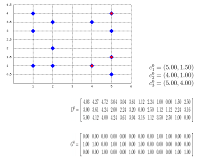
Well, this probably isn't a best-selling app, but it might be useful for some who, like me, have to explain how k-means clustering algorithm works or to prepare exercises about it. Also, this works as an example on how to embed latex formulas inside images with Perl: the script actually draws the plane (with points and centroids) inside an image, then generates latex formulas which describe the algorithm evolution, compiles them into images with tex2im and embeds them inside the main picture. The final output is made of many different pictures, one for each step of the algorithm, similar to the following one:
Of course, the script is still far from perfect but (again, of course) the source code is provided so you can change/correct/ameliorate it. To run it you will also need text2im, which is downloadable here (a big THANK YOU to Andreas Reigber who created this nice shell script), and of course latex stuff.